
Most people think monochrome dressing is easy. Throw on matching colors, add a clean sneaker, and suddenly you’re “quiet luxury.” Not exactly. The difference between looking intentional and looking like you just grabbed random pieces in the dark usually comes down to texture, fit, and contrast. Sure, wearing all black or all cream looks incredibly high-end when done right. But, when it’s done wrong you could be out here looking like Boo Boo the Fool. That’s why here at FitGrades. We are compiling the ultimate guide to monochromatic dressing.
Here are the rules.
Rule 1: Play the Shade Game
Monochrome doesn’t mean matching. It means coordinating. If every piece is the exact same tone, your fit starts to look accidental — like you grabbed whatever was closest to the dryer. The move is to jump around the spectrum. Think one light, two darks. Or a mid-tone base with a washed-out top and deep-dyed bottoms. You want enough contrast within the color family to show that you built something, not just put something on. Also, don’t be afraid to play around with color. All blue, all yellow, all green. Think outside the box and you’ll be shining.
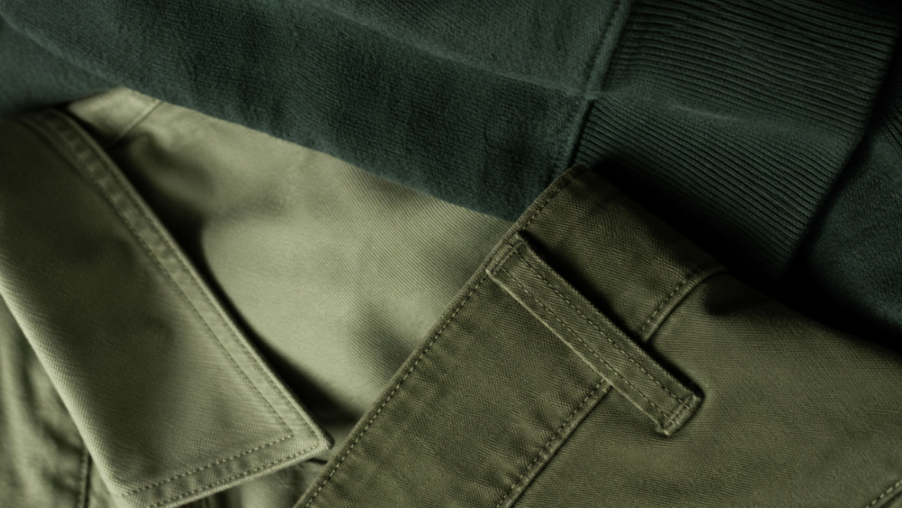
Rule 2: Let a Neutral Do the Heavy Lifting
A pop of a neutral — white, cream, tan, grey — acts as a visual boundary between your pieces. It gives the eye somewhere to land and keeps the look from bleeding together. A cream tee layered under an olive jacket with olive cargos. An ivory undershirt breaking up a full navy fit. It’s a small addition that signals a lot of thought.
Rule 3: Hardware and Accents Are Working Overtime
When color isn’t doing the contrast work, hardware steps up. Zippers, metal buttons, grommets, buckles — these details pop differently against a monochrome backdrop. They’re doing contrast work quietly, which is exactly the kind of styling that makes people stop and ask what are you wearing. Don’t sleep on the details.
Rule 4: Texture Is Your Best Friend
This is the real cheat code. Mixing textures within a single color family is one of the most underrated moves in getting dressed. A matte cotton tee against a waxy nylon jacket. Ribbed knit with smooth denim. Rough canvas sneakers on a clean, pressed fit. Texture gives your eye something to travel across the outfit — and it’s what separates a well-built monochrome look from a set.
Speaking of sets: sets can absolutely go hard when done right. But there’s something inherently cooler about not matching — about pulling from different pieces and making them speak the same visual language. That’s actual style. That’s the whole point.
Rule 5: Patterns Break Monotony Without Breaking the Color Story
A tonal pattern — a navy pinstripe in an all-navy fit, a cream floral on an all-white look — keeps the color story intact while adding visual texture that reads as intentional. You’re not abandoning the monochrome concept. You’re layering depth into it. And depth is what gets outfits remembered.
Monochrome done right isn’t lazy. It’s one of the highest-level expressions of getting dressed — because you’re working with one hand tied behind your back and still making it look easy. That’s the whole vibe.